
These posters are very simple and only has two food items on display and the text is very prominent on the poster, so that the viewer can see the text clearly. There is simple colouring used as only two main colours are used for these posters. As the utensils are black this makes them stand out from the background to attract the viewer.


This poster has many things going on in the posters which at first glance may look cluttered, however then as you look at the poster it is well organised and laid out in a creative way. Even though the background is not simple or one plain colour the poster still makes the food stand out and become the main focus. There is much text which informs the viewer when looking at the image.
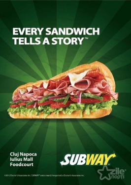 As this poster is for a big branch which is why it looks very similar to other fast food franchises. The simple colours of the background make the sandwich stand out and make the food look appealing, this is what you want to achieve with a poster. Lines going towards the food leads the attention of the viewer along the lines to the food. The colour green in the background connects with the green in the food and the green on the logo of the branch. Making the poster more effective as an advertising product.
This poster is for a community cafe which is why it includes a fair amount of text so that anyone that reads gets all the information they need. It includes no food, however it's very friendly,appealing and effective. I could recreate but I would include food to incorporate the project. The rustic colouring makes the poster more effective as it's attention grabbing to viewers. There is matching colour on this which makes the attention of the viewer go from information to information that is on the poster. The text information is not jumbled and is easy to read. This is shown in the poster below as it is very similar to this poster, which are both successful advertising posters.

No comments:
Post a Comment