Overall thoughts
When I was told
that this project was to do with food I was very happy as I love food. This
project allowed me to take photographs of food then consume the food. I picked
food items such as sweets and take out because I like these food items. All the
photo shoots I did where taken at my house and this gave me all the time I
needed to take the image I thought was the best. For my photographs I used a
manual setting for my camera and lens as I wanted complete control over my
images. I experimented most with sweets as I had more options on what to
photograph plus I also what include colourful wrappers in my images. For my
posters I differed from my original ideas but I believe this helped me achieve successful
posters. When we first started the project I thought it was about still life,
as we were asked to take photographs of an apple which I associate with still
life. The main lighting I used window light and lamps as I think these both can
highlight food very well. All the items were easy to obtain and accessible to
me at my house. I enjoyed this project as I was able to experiment with my
camera, lighting I used and props in my photos and where I placed them. My favourite
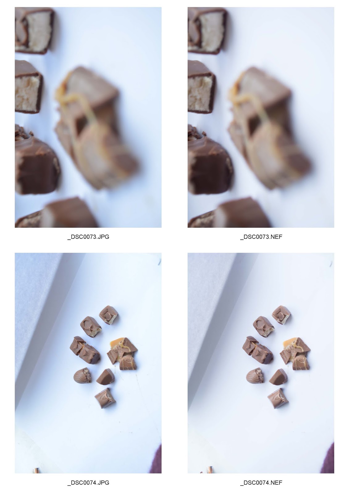
photo shoot was the chocolates shoot as I got to use the wrappers to frame the
sweets and add an interesting aspect to the image.
Posters
These posters
were created to advertise food or a place where food is eaten, another aim of
these posters it to grab the attention of viewers that come across the poster. I
picked images I thought were successful and effective, images which would
attract attention and advertise food in the best way making viewers want to buy
the food. I prefer the first poster as its more colourful, attractive and effective. For the first poster I included illustrations, this is the owl and cupcake, both are to fit the theme of sweets and I added the owl to add to a creative visual link to the title. I also achieved with the cupcake as I used both colours on the frosting in the title. Bordering the text and entire poster fits in with my original ideas for my posters. I have included more text on the first poster which is why its more successful which I also made colourful to make the poster more attractive. Making the images the same size and placement makes the poster attractive on both posters.